" height="80px" id="OJKMuZrXm" width="355px"/><path d="M 18.327 2.426 C 19.895 4.043 20.989 6.697 21.61 10.388 L 23.864 23.324 L 26.265 23.324 L 23.521 7.644 C 23.388 6.867 23.322 6.08 23.325 5.292 C 23.325 3.659 23.937 2.369 25.163 1.421 C 26.388 0.474 28.143 0 30.43 0 C 32.521 0 34.219 0.604 35.527 1.813 C 36.833 3.021 37.805 4.982 38.442 7.693 C 39.08 10.405 39.398 14.063 39.398 18.669 C 39.398 23.406 38.989 27.121 38.172 29.816 C 37.356 32.511 36.066 34.439 34.301 35.598 C 32.537 36.757 30.136 37.337 27.098 37.337 C 23.734 37.337 21.284 36.414 19.748 34.568 C 18.212 32.723 17.445 30.068 17.445 26.606 L 17.445 14.013 L 15.092 14.013 L 15.092 28.566 C 15.092 31.572 14.472 33.784 13.231 35.205 C 11.989 36.626 10.372 37.337 8.379 37.337 C 6.419 37.337 4.827 36.756 3.602 35.598 C 2.377 34.439 1.47 32.494 0.882 29.767 C 0.294 27.04 0 23.34 0 18.668 C 0 14.03 0.399 10.355 1.2 7.643 C 2.001 4.932 3.25 2.981 4.949 1.788 C 6.647 0.596 8.934 0 11.809 0 C 14.584 0 16.757 0.809 18.326 2.425 Z M 49.001 37.339 C 46.191 37.339 44.093 36.53 42.705 34.913 C 41.316 33.296 40.622 31.246 40.622 28.764 C 40.622 24.191 42.043 18.376 44.886 11.32 C 46.062 8.446 47.229 6.192 48.389 4.558 C 49.548 2.925 50.864 1.758 52.333 1.055 C 53.804 0.353 55.6 0.002 57.724 0.002 C 59.814 0.002 61.595 0.353 63.065 1.055 C 64.535 1.758 65.849 2.917 67.009 4.534 C 68.168 6.151 69.336 8.413 70.513 11.321 C 73.419 18.443 74.873 24.257 74.873 28.765 C 74.873 31.248 74.179 33.298 72.791 34.914 C 71.402 36.531 69.287 37.34 66.445 37.34 C 61.414 37.34 58.899 34.482 58.899 28.765 L 58.899 8.135 L 56.546 8.135 L 56.546 28.764 C 56.546 34.481 54.03 37.339 49 37.339 Z M 75.829 1.789 C 78.523 0.597 82.696 0.001 88.349 0.001 C 94.002 0.001 98.164 0.597 100.844 1.789 C 103.522 2.982 104.862 4.836 104.862 7.351 C 104.862 9.671 104.053 11.296 102.436 12.227 C 100.82 13.158 98.458 13.574 95.356 13.476 C 95.715 16.808 95.895 19.83 95.895 22.541 C 95.895 27.833 95.265 31.623 94.008 33.909 C 92.75 36.196 90.863 37.339 88.349 37.339 C 85.835 37.339 83.947 36.196 82.689 33.909 C 81.431 31.623 80.803 27.833 80.803 22.541 C 80.803 19.83 80.982 16.808 81.342 13.476 C 78.238 13.574 75.869 13.158 74.237 12.227 C 72.603 11.296 71.787 9.671 71.787 7.351 C 71.787 4.836 73.135 2.983 75.83 1.789 Z M 106.233 7.277 C 106.885 4.582 107.808 2.695 109.002 1.617 C 110.193 0.539 111.704 0 113.534 0 C 118.107 0 120.394 3.021 120.394 9.065 L 120.394 15.337 L 122.794 15.337 L 122.794 9.065 C 122.794 3.022 125.08 0 129.654 0 C 131.483 0 132.994 0.539 134.186 1.617 C 135.378 2.695 136.301 4.581 136.955 7.277 C 137.608 9.972 137.935 13.704 137.935 18.473 C 137.935 23.373 137.608 27.195 136.955 29.939 C 136.302 32.683 135.379 34.603 134.186 35.696 C 132.994 36.79 131.483 37.338 129.654 37.338 C 127.53 37.338 125.856 36.603 124.632 35.133 C 123.406 33.663 122.794 31.442 122.794 28.469 L 122.794 22.246 L 120.394 22.246 L 120.394 28.469 C 120.394 31.442 119.781 33.663 118.556 35.133 C 117.331 36.603 115.657 37.338 113.534 37.338 C 111.704 37.338 110.193 36.791 109.002 35.696 C 107.809 34.602 106.886 32.682 106.233 29.939 C 105.579 27.195 105.253 23.373 105.253 18.473 C 105.253 13.704 105.579 9.972 106.233 7.277 Z M 147.539 37.339 C 144.729 37.339 142.631 36.53 141.243 34.913 C 139.854 33.296 139.16 31.246 139.16 28.764 C 139.16 24.191 140.581 18.376 143.424 11.32 C 144.6 8.446 145.767 6.192 146.927 4.558 C 148.086 2.925 149.402 1.758 150.871 1.055 C 152.342 0.353 154.138 0.002 156.262 0.002 C 158.352 0.002 160.133 0.353 161.603 1.055 C 163.073 1.758 164.387 2.917 165.547 4.534 C 166.706 6.151 167.874 8.413 169.051 11.321 C 171.957 18.443 173.411 24.257 173.411 28.765 C 173.411 31.248 172.717 33.298 171.329 34.914 C 169.94 36.531 167.825 37.34 164.983 37.34 C 159.952 37.34 157.437 34.482 157.437 28.765 L 157.437 8.135 L 155.084 8.135 L 155.084 28.764 C 155.084 34.481 152.568 37.339 147.538 37.339 Z M 192.962 2.426 C 194.53 4.043 195.624 6.697 196.245 10.388 L 198.499 23.324 L 200.9 23.324 L 198.156 7.644 C 198.023 6.867 197.957 6.08 197.96 5.292 C 197.96 3.659 198.572 2.369 199.798 1.421 C 201.023 0.474 202.778 0 205.065 0 C 207.156 0 208.854 0.604 210.162 1.813 C 211.468 3.021 212.44 4.982 213.077 7.693 C 213.715 10.405 214.033 14.063 214.033 18.669 C 214.033 23.406 213.624 27.121 212.807 29.816 C 211.991 32.511 210.701 34.439 208.936 35.598 C 207.172 36.757 204.771 37.337 201.733 37.337 C 198.369 37.337 195.919 36.414 194.383 34.568 C 192.847 32.723 192.08 30.068 192.08 26.606 L 192.08 14.013 L 189.727 14.013 L 189.727 28.566 C 189.727 31.572 189.107 33.784 187.866 35.205 C 186.624 36.626 185.007 37.337 183.014 37.337 C 181.054 37.337 179.462 36.756 178.237 35.598 C 177.012 34.439 176.105 32.494 175.517 29.767 C 174.929 27.04 174.635 23.34 174.635 18.668 C 174.635 14.03 175.034 10.355 175.835 7.643 C 176.636 4.932 177.885 2.981 179.584 1.788 C 181.282 0.596 183.569 0 186.444 0 C 189.219 0 191.392 0.809 192.961 2.425 Z M 24.085 43.324 C 26.648 44.206 28.593 45.415 29.916 46.95 C 31.238 48.486 31.9 50.217 31.9 52.144 C 31.9 53.974 31.418 55.542 30.455 56.848 C 29.49 58.155 28.208 59.086 26.608 59.641 L 26.608 59.837 C 27.62 60.099 28.617 60.646 29.596 61.479 C 30.576 62.312 31.393 63.456 32.046 64.909 C 32.699 66.363 33.026 68.07 33.026 70.03 C 33.026 73.199 32.283 75.542 30.797 77.062 C 29.31 78.581 27.26 79.34 24.648 79.34 C 19.845 79.34 17.445 76.351 17.445 70.373 L 17.445 50.136 L 15.092 50.136 L 15.092 70.373 C 15.092 73.149 14.521 75.339 13.377 76.939 C 12.233 78.54 10.601 79.34 8.478 79.34 C 6.518 79.34 4.925 78.817 3.7 77.772 C 2.475 76.727 1.553 74.841 0.932 72.113 C 0.311 69.386 0 65.555 0 60.623 C 0 55.266 0.399 51.297 1.2 48.716 C 2.001 46.136 3.422 44.372 5.464 43.424 C 7.505 42.477 10.65 42.003 14.897 42.003 C 18.457 42.003 21.519 42.444 24.085 43.326 Z M 34.986 49.204 C 35.542 46.525 36.366 44.655 37.461 43.593 C 38.555 42.532 40.001 42.001 41.798 42.001 C 43.595 42.001 45.039 42.532 46.134 43.593 C 47.229 44.655 48.053 46.525 48.609 49.204 C 49.164 51.883 49.442 55.64 49.442 60.474 C 49.442 65.44 49.164 69.286 48.609 72.014 C 48.053 74.742 47.229 76.644 46.134 77.722 C 45.039 78.8 43.594 79.339 41.798 79.339 C 40.002 79.339 38.555 78.8 37.461 77.722 C 36.366 76.644 35.542 74.742 34.986 72.014 C 34.43 69.287 34.153 65.44 34.153 60.474 C 34.153 55.64 34.43 51.883 34.986 49.204 Z M 53.876 43.789 C 56.57 42.597 60.743 42.001 66.396 42.001 C 72.049 42.001 76.211 42.597 78.891 43.789 C 81.569 44.982 82.909 46.836 82.909 49.351 C 82.909 51.671 82.1 53.296 80.483 54.227 C 78.867 55.158 76.505 55.574 73.403 55.476 C 73.762 58.808 73.942 61.83 73.942 64.541 C 73.942 69.833 73.312 73.623 72.055 75.909 C 70.797 78.196 68.91 79.339 66.396 79.339 C 63.882 79.339 61.994 78.196 60.736 75.909 C 59.478 73.623 58.85 69.833 58.85 64.541 C 58.85 61.83 59.029 58.808 59.389 55.476 C 56.285 55.574 53.916 55.158 52.284 54.227 C 50.65 53.296 49.834 51.671 49.834 49.351 C 49.834 46.836 51.182 44.983 53.877 43.789 Z M 87.93 43.789 C 90.624 42.597 94.797 42.001 100.45 42.001 C 106.103 42.001 110.265 42.597 112.945 43.789 C 115.623 44.982 116.963 46.836 116.963 49.351 C 116.963 51.671 116.154 53.296 114.537 54.227 C 112.921 55.158 110.559 55.574 107.457 55.476 C 107.816 58.808 107.996 61.83 107.996 64.541 C 107.996 69.833 107.366 73.623 106.109 75.909 C 104.851 78.196 102.964 79.339 100.45 79.339 C 97.936 79.339 96.048 78.196 94.79 75.909 C 93.532 73.623 92.904 69.833 92.904 64.541 C 92.904 61.83 93.083 58.808 93.443 55.476 C 90.339 55.574 87.97 55.158 86.338 54.227 C 84.704 53.296 83.888 51.671 83.888 49.351 C 83.888 46.836 85.236 44.983 87.931 43.789 Z M 143.226 43.446 C 145.382 44.41 146.46 45.904 146.46 47.929 C 146.46 49.922 145.659 51.303 144.059 52.07 C 142.458 52.838 140.106 53.221 137.003 53.221 L 130.24 53.221 L 130.24 55.083 L 137.003 55.083 C 139.714 55.083 141.796 55.475 143.25 56.259 C 144.703 57.043 145.431 58.497 145.431 60.62 C 145.431 62.743 144.703 64.205 143.25 65.005 C 141.796 65.806 139.714 66.206 137.003 66.206 L 130.24 66.206 L 130.24 68.068 L 137.003 68.068 C 140.106 68.068 142.458 68.444 144.059 69.195 C 145.66 69.947 146.46 71.286 146.46 73.213 C 146.46 75.304 145.39 76.839 143.25 77.819 C 141.11 78.799 137.705 79.289 133.033 79.289 C 128.982 79.289 125.871 78.831 123.699 77.917 C 121.526 77.003 119.926 75.222 118.897 72.576 C 117.868 69.93 117.353 65.945 117.353 60.62 C 117.353 55.328 117.868 51.359 118.897 48.713 C 119.925 46.067 121.526 44.287 123.699 43.372 C 125.871 42.457 128.967 42 132.984 42 C 137.655 42 141.069 42.482 143.225 43.445 Z M 165.913 44.426 C 167.481 46.043 168.575 48.697 169.196 52.388 L 171.45 65.324 L 173.851 65.324 L 171.107 49.644 C 170.974 48.867 170.908 48.08 170.911 47.292 C 170.911 45.659 171.523 44.369 172.749 43.421 C 173.974 42.474 175.729 42 178.016 42 C 180.107 42 181.805 42.604 183.113 43.813 C 184.419 45.021 185.391 46.982 186.028 49.693 C 186.666 52.405 186.984 56.063 186.984 60.669 C 186.984 65.406 186.575 69.121 185.758 71.816 C 184.942 74.511 183.652 76.439 181.887 77.598 C 180.123 78.757 177.722 79.337 174.684 79.337 C 171.32 79.337 168.87 78.414 167.334 76.568 C 165.798 74.723 165.031 72.068 165.031 68.606 L 165.031 56.013 L 162.678 56.013 L 162.678 70.566 C 162.678 73.572 162.058 75.784 160.817 77.205 C 159.575 78.626 157.958 79.337 155.965 79.337 C 154.005 79.337 152.413 78.756 151.188 77.598 C 149.963 76.439 149.056 74.494 148.468 71.767 C 147.88 69.04 147.586 65.34 147.586 60.668 C 147.586 56.03 147.985 52.355 148.786 49.643 C 149.587 46.932 150.836 44.981 152.535 43.788 C 154.233 42.596 156.52 42 159.395 42 C 162.17 42 164.343 42.809 165.912 44.425 Z M 189.727 49.277 C 190.379 46.582 191.302 44.695 192.496 43.617 C 193.687 42.539 195.198 42 197.028 42 C 201.601 42 203.888 45.021 203.888 51.065 L 203.888 57.337 L 206.288 57.337 L 206.288 51.065 C 206.288 45.022 208.574 42 213.148 42 C 214.977 42 216.488 42.539 217.68 43.617 C 218.872 44.695 219.795 46.581 220.449 49.277 C 221.102 51.972 221.429 55.704 221.429 60.473 C 221.429 65.373 221.102 69.195 220.449 71.939 C 219.796 74.683 218.873 76.603 217.68 77.696 C 216.488 78.79 214.977 79.338 213.148 79.338 C 211.024 79.338 209.35 78.603 208.126 77.133 C 206.9 75.663 206.288 73.442 206.288 70.469 L 206.288 64.246 L 203.888 64.246 L 203.888 70.469 C 203.888 73.442 203.275 75.663 202.05 77.133 C 200.825 78.603 199.151 79.338 197.028 79.338 C 195.198 79.338 193.687 78.791 192.496 77.696 C 191.303 76.602 190.38 74.682 189.727 71.939 C 189.073 69.195 188.747 65.373 188.747 60.473 C 188.747 55.704 189.073 51.972 189.727 49.277 Z M 230.25 76.888 C 227.733 75.255 225.896 73.042 224.737 70.248 C 223.577 67.455 222.997 64.263 222.997 60.669 C 222.997 57.075 223.577 53.882 224.737 51.089 C 225.896 48.296 227.733 46.083 230.25 44.449 C 232.765 42.816 235.966 41.999 239.854 41.999 C 243.742 41.999 246.934 42.816 249.433 44.449 C 251.932 46.083 253.761 48.296 254.921 51.089 C 256.08 53.882 256.66 57.075 256.66 60.669 C 256.66 64.263 256.08 67.455 254.921 70.248 C 253.761 73.041 251.932 75.255 249.433 76.888 C 246.934 78.522 243.741 79.338 239.854 79.338 C 235.967 79.338 232.765 78.522 230.25 76.888 Z M 241.029 71.156 L 241.029 50.135 L 238.677 50.135 L 238.677 71.156 Z M 262.026 74.292 C 259.428 70.928 258.13 66.077 258.13 59.739 C 258.13 53.827 258.742 49.392 259.967 46.436 C 261.193 43.48 263.373 42.001 266.509 42.001 C 268.893 42.001 270.616 42.81 271.678 44.426 C 272.74 46.043 273.271 48.223 273.271 50.968 L 273.271 70.568 L 275.624 70.568 L 275.624 50.968 C 275.624 48.224 276.154 46.044 277.216 44.426 C 278.278 42.809 280.001 42.001 282.386 42.001 C 285.522 42.001 287.702 43.48 288.927 46.436 C 290.153 49.393 290.765 53.827 290.765 59.739 C 290.765 66.077 289.466 70.928 286.869 74.292 C 284.272 77.657 280.132 79.339 274.447 79.339 C 268.762 79.339 264.623 77.657 262.026 74.292 Z M 294.316 47.195 C 295.704 45.562 297.607 44.288 300.024 43.373 C 302.442 42.458 305.153 42.001 308.159 42.001 C 311.295 42.001 313.99 42.368 316.244 43.104 C 318.498 43.839 320.204 44.835 321.364 46.093 C 322.523 47.351 323.103 48.731 323.103 50.234 C 323.103 52.129 322.27 53.403 320.604 54.056 C 318.938 54.71 316.489 55.036 313.254 55.036 L 305.022 55.036 L 305.022 57.388 L 311.785 57.388 C 314.169 57.388 316.244 57.78 318.008 58.564 C 319.772 59.348 321.144 60.483 322.124 61.969 C 323.103 63.456 323.594 65.227 323.594 67.285 C 323.594 69.768 322.948 71.908 321.658 73.704 C 320.367 75.501 318.481 76.889 315.999 77.869 C 313.516 78.849 310.527 79.339 307.032 79.339 C 304.189 79.339 301.625 78.963 299.339 78.212 C 297.052 77.461 295.247 76.367 293.925 74.929 C 292.602 73.492 291.94 71.826 291.94 69.931 C 291.94 68.2 292.438 66.934 293.435 66.134 C 294.431 65.334 295.705 64.893 297.257 64.811 C 298.808 64.729 300.515 64.868 302.377 65.227 L 312.226 67.138 L 312.226 64.737 L 302.329 62.826 C 298.801 62.14 296.236 60.981 294.636 59.347 C 293.035 57.714 292.235 55.525 292.235 52.781 C 292.235 50.691 292.929 48.829 294.318 47.195 Z M 350.739 43.446 C 352.895 44.41 353.973 45.904 353.973 47.929 C 353.973 49.922 353.172 51.303 351.572 52.07 C 349.971 52.838 347.619 53.221 344.516 53.221 L 337.753 53.221 L 337.753 55.083 L 344.516 55.083 C 347.227 55.083 349.309 55.475 350.763 56.259 C 352.216 57.043 352.944 58.497 352.944 60.62 C 352.944 62.743 352.216 64.205 350.763 65.005 C 349.309 65.806 347.227 66.206 344.516 66.206 L 337.753 66.206 L 337.753 68.068 L 344.516 68.068 C 347.619 68.068 349.971 68.444 351.572 69.195 C 353.173 69.947 353.973 71.286 353.973 73.213 C 353.973 75.304 352.903 76.839 350.763 77.819 C 348.623 78.799 345.218 79.289 340.546 79.289 C 336.495 79.289 333.384 78.831 331.212 77.917 C 329.039 77.003 327.439 75.222 326.41 72.576 C 325.381 69.93 324.866 65.945 324.866 60.62 C 324.866 55.328 325.381 51.359 326.41 48.713 C 327.438 46.067 329.039 44.287 331.212 43.372 C 333.384 42.457 336.48 42 340.497 42 C 345.168 42 348.582 42.482 350.738 43.445 Z M 224.393 13.719 C 223.361 13.719 222.59 13.422 222.08 12.828 C 221.57 12.234 221.315 11.481 221.315 10.569 C 221.315 8.889 221.837 6.753 222.881 4.161 C 223.313 3.105 223.741 2.277 224.167 1.677 C 224.594 1.077 225.076 0.648 225.616 0.39 C 226.156 0.132 226.816 0.003 227.596 0.003 C 228.364 0.003 229.018 0.132 229.558 0.39 C 230.098 0.648 230.58 1.074 231.007 1.668 C 231.433 2.262 231.861 3.093 232.294 4.161 C 233.361 6.777 233.896 8.913 233.896 10.569 C 233.896 11.481 233.641 12.234 233.131 12.828 C 232.62 13.422 231.844 13.719 230.8 13.719 C 228.951 13.719 228.028 12.669 228.028 10.569 L 228.028 2.991 L 227.164 2.991 L 227.164 10.569 C 227.164 12.669 226.24 13.719 224.393 13.719 Z M 243.194 0.489 C 244.136 0.813 244.85 1.257 245.337 1.821 C 245.822 2.385 246.066 3.021 246.066 3.729 C 246.066 4.401 245.889 4.977 245.535 5.457 C 245.181 5.937 244.71 6.279 244.122 6.483 L 244.122 6.555 C 244.494 6.652 244.86 6.852 245.221 7.159 C 245.58 7.465 245.88 7.885 246.12 8.419 C 246.36 8.953 246.48 9.58 246.48 10.3 C 246.48 11.464 246.207 12.325 245.661 12.883 C 245.115 13.441 244.362 13.72 243.402 13.72 C 241.638 13.72 240.756 12.622 240.756 10.426 L 240.756 2.991 L 239.892 2.991 L 239.892 10.425 C 239.892 11.445 239.682 12.249 239.262 12.837 C 238.841 13.425 238.241 13.719 237.462 13.719 C 236.741 13.719 236.156 13.527 235.706 13.143 C 235.257 12.759 234.917 12.066 234.689 11.064 C 234.46 10.062 234.347 8.655 234.347 6.843 C 234.347 4.875 234.493 3.417 234.787 2.469 C 235.081 1.521 235.603 0.873 236.353 0.525 C 237.103 0.177 238.258 0.003 239.818 0.003 C 241.126 0.003 242.251 0.165 243.193 0.489 Z M 247.874 0.66 C 248.864 0.222 250.397 0.003 252.474 0.003 C 254.551 0.003 256.079 0.222 257.064 0.66 C 258.047 1.098 258.54 1.779 258.54 2.703 C 258.54 3.555 258.243 4.152 257.649 4.494 C 257.055 4.836 256.188 4.989 255.047 4.953 C 255.18 6.177 255.245 7.287 255.245 8.283 C 255.245 10.227 255.014 11.619 254.553 12.459 C 254.09 13.299 253.398 13.719 252.474 13.719 C 251.55 13.719 250.857 13.299 250.395 12.459 C 249.933 11.619 249.702 10.227 249.702 8.283 C 249.702 7.287 249.768 6.177 249.9 4.953 C 248.759 4.989 247.89 4.836 247.29 4.494 C 246.69 4.152 246.391 3.555 246.391 2.703 C 246.391 1.779 246.886 1.098 247.875 0.66 Z M 264.236 13.044 C 263.498 12.594 262.988 11.886 262.706 10.92 C 262.424 9.954 262.283 8.601 262.283 6.861 C 262.283 5.121 262.424 3.768 262.706 2.802 C 262.988 1.836 263.498 1.128 264.236 0.678 C 264.973 0.228 266.05 0.003 267.466 0.003 C 268.918 0.003 270.149 0.303 271.156 0.903 C 272.163 1.503 272.92 2.322 273.424 3.36 C 273.928 4.398 274.18 5.565 274.18 6.861 C 274.18 8.157 273.928 9.324 273.424 10.362 C 272.92 11.4 272.164 12.219 271.156 12.819 C 270.148 13.419 268.918 13.719 267.466 13.719 C 266.05 13.719 264.973 13.494 264.236 13.044 Z M 268.619 10.713 L 268.619 2.991 L 267.755 2.991 L 267.755 10.713 Z M 275.062 2.649 C 275.266 1.665 275.569 0.978 275.971 0.588 C 276.372 0.198 276.904 0.003 277.564 0.003 C 278.224 0.003 278.755 0.198 279.157 0.588 C 279.559 0.978 279.862 1.665 280.066 2.649 C 280.27 3.633 280.373 5.013 280.373 6.789 C 280.373 8.613 280.27 10.026 280.066 11.028 C 279.862 12.03 279.559 12.729 279.157 13.125 C 278.756 13.521 278.224 13.719 277.564 13.719 C 276.904 13.719 276.373 13.521 275.971 13.125 C 275.569 12.729 275.266 12.03 275.062 11.028 C 274.858 10.027 274.756 8.613 274.756 6.789 C 274.756 5.013 274.858 3.633 275.062 2.649 Z M 289.868 0.489 C 290.81 0.813 291.524 1.257 292.011 1.821 C 292.496 2.385 292.74 3.021 292.74 3.729 C 292.74 4.401 292.563 4.977 292.209 5.457 C 291.855 5.937 291.384 6.279 290.796 6.483 L 290.796 6.555 C 291.168 6.652 291.534 6.852 291.895 7.159 C 292.254 7.465 292.554 7.885 292.794 8.419 C 293.034 8.953 293.154 9.58 293.154 10.3 C 293.154 11.464 292.881 12.325 292.335 12.883 C 291.789 13.441 291.036 13.72 290.076 13.72 C 288.312 13.72 287.43 12.622 287.43 10.426 L 287.43 2.991 L 286.566 2.991 L 286.566 10.425 C 286.566 11.445 286.356 12.249 285.936 12.837 C 285.515 13.425 284.915 13.719 284.136 13.719 C 283.415 13.719 282.83 13.527 282.38 13.143 C 281.931 12.759 281.591 12.066 281.363 11.064 C 281.134 10.062 281.021 8.655 281.021 6.843 C 281.021 4.875 281.167 3.417 281.461 2.469 C 281.755 1.521 282.277 0.873 283.027 0.525 C 283.777 0.177 284.932 0.003 286.492 0.003 C 287.8 0.003 288.925 0.165 289.867 0.489 Z M 303.071 0.534 C 303.863 0.888 304.259 1.437 304.259 2.18 C 304.259 2.912 303.965 3.419 303.377 3.701 C 302.789 3.983 301.925 4.124 300.785 4.124 L 298.301 4.124 L 298.301 4.808 L 300.785 4.808 C 301.781 4.808 302.546 4.952 303.08 5.24 C 303.614 5.528 303.881 6.062 303.881 6.842 C 303.881 7.622 303.614 8.159 303.08 8.453 C 302.546 8.747 301.781 8.894 300.785 8.894 L 298.301 8.894 L 298.301 9.578 L 300.785 9.578 C 301.925 9.578 302.789 9.716 303.377 9.992 C 303.965 10.268 304.259 10.76 304.259 11.468 C 304.259 12.237 303.866 12.8 303.08 13.16 C 302.294 13.52 301.043 13.7 299.327 13.7 C 297.839 13.7 296.696 13.532 295.898 13.196 C 295.099 12.861 294.511 12.206 294.133 11.234 C 293.755 10.262 293.567 8.798 293.567 6.842 C 293.567 4.898 293.755 3.44 294.133 2.468 C 294.511 1.496 295.099 0.842 295.898 0.506 C 296.696 0.17 297.833 0.002 299.309 0.002 C 301.025 0.002 302.279 0.179 303.071 0.533 Z M 311.773 6.411 C 311.479 6.351 311.296 6.219 311.224 6.015 C 311.152 5.811 311.116 5.397 311.116 4.773 L 311.116 2.991 L 310.253 2.991 L 310.253 10.677 L 311.116 10.677 L 311.116 9.111 C 311.116 8.475 311.152 8.052 311.224 7.842 C 311.296 7.632 311.479 7.5 311.773 7.446 C 312.067 7.392 312.646 7.365 313.51 7.365 C 314.386 7.365 315.042 7.444 315.481 7.599 C 315.919 7.755 316.213 7.99 316.363 8.301 C 316.513 8.613 316.589 9.039 316.589 9.579 C 316.589 10.287 316.385 10.956 315.977 11.586 C 315.569 12.216 314.933 12.729 314.069 13.125 C 313.206 13.521 312.119 13.719 310.811 13.719 C 309.372 13.719 308.189 13.419 307.265 12.819 C 306.341 12.219 305.665 11.406 305.24 10.38 C 304.815 9.354 304.601 8.181 304.601 6.861 C 304.601 5.541 304.814 4.368 305.24 3.342 C 305.666 2.316 306.342 1.503 307.265 0.903 C 308.188 0.303 309.371 0.003 310.811 0.003 C 312.071 0.003 313.136 0.228 314.006 0.678 C 314.876 1.128 315.524 1.689 315.949 2.361 C 316.375 3.033 316.589 3.699 316.589 4.359 C 316.589 4.875 316.514 5.283 316.363 5.583 C 316.214 5.883 315.92 6.111 315.481 6.267 C 315.042 6.423 314.386 6.501 313.51 6.501 C 312.646 6.501 312.067 6.471 311.773 6.411 Z M 318.325 0.66 C 319.315 0.222 320.848 0.003 322.925 0.003 C 325.002 0.003 326.53 0.222 327.515 0.66 C 328.498 1.098 328.991 1.779 328.991 2.703 C 328.991 3.555 328.694 4.152 328.1 4.494 C 327.506 4.836 326.639 4.989 325.498 4.953 C 325.631 6.177 325.696 7.287 325.696 8.283 C 325.696 10.227 325.465 11.619 325.004 12.459 C 324.541 13.299 323.849 13.719 322.925 13.719 C 322.001 13.719 321.308 13.299 320.846 12.459 C 320.384 11.619 320.153 10.227 320.153 8.283 C 320.153 7.287 320.219 6.177 320.351 4.953 C 319.21 4.989 318.341 4.836 317.741 4.494 C 317.141 4.152 316.842 3.555 316.842 2.703 C 316.842 1.779 317.337 1.098 318.326 0.66 Z M 331.546 12.819 C 330.622 12.219 329.946 11.406 329.521 10.38 C 329.096 9.354 328.882 8.181 328.882 6.861 C 328.882 5.541 329.095 4.368 329.521 3.342 C 329.947 2.316 330.623 1.503 331.546 0.903 C 332.469 0.303 333.646 0.003 335.074 0.003 C 336.502 0.003 337.675 0.303 338.593 0.903 C 339.511 1.503 340.183 2.316 340.609 3.342 C 341.036 4.368 341.249 5.541 341.249 6.861 C 341.249 8.181 341.036 9.354 340.609 10.38 C 340.183 11.406 339.511 12.219 338.593 12.819 C 337.675 13.419 336.502 13.719 335.074 13.719 C 333.646 13.719 332.47 13.419 331.546 12.819 Z M 335.506 10.713 L 335.506 2.991 L 334.642 2.991 L 334.642 10.713 Z M 350.671 0.489 C 351.613 0.813 352.327 1.257 352.814 1.821 C 353.299 2.385 353.543 3.021 353.543 3.729 C 353.543 4.401 353.366 4.977 353.012 5.457 C 352.658 5.937 352.187 6.279 351.599 6.483 L 351.599 6.555 C 351.971 6.652 352.337 6.852 352.698 7.159 C 353.057 7.465 353.357 7.885 353.597 8.419 C 353.837 8.953 353.957 9.58 353.957 10.3 C 353.957 11.464 353.684 12.325 353.138 12.883 C 352.592 13.441 351.839 13.72 350.879 13.72 C 349.115 13.72 348.233 12.622 348.233 10.426 L 348.233 2.991 L 347.369 2.991 L 347.369 10.425 C 347.369 11.445 347.159 12.249 346.739 12.837 C 346.318 13.425 345.718 13.719 344.939 13.719 C 344.218 13.719 343.633 13.527 343.183 13.143 C 342.734 12.759 342.394 12.066 342.166 11.064 C 341.937 10.062 341.824 8.655 341.824 6.843 C 341.824 4.875 341.97 3.417 342.264 2.469 C 342.558 1.521 343.08 0.873 343.83 0.525 C 344.58 0.177 345.735 0.003 347.295 0.003 C 348.603 0.003 349.728 0.165 350.67 0.489 Z M 247.532 25.286 C 248.042 24.956 248.849 24.875 249.953 25.043 C 249.785 23.939 249.866 23.132 250.196 22.622 C 250.526 22.112 250.973 21.857 251.537 21.857 C 252.101 21.857 252.548 22.112 252.878 22.622 C 253.208 23.132 253.289 23.939 253.121 25.043 C 254.225 24.875 255.032 24.956 255.542 25.286 C 256.053 25.616 256.308 26.063 256.308 26.627 C 256.308 27.191 256.053 27.638 255.542 27.968 C 255.032 28.298 254.226 28.379 253.121 28.211 C 253.289 29.315 253.208 30.122 252.878 30.632 C 252.548 31.142 252.102 31.397 251.537 31.397 C 250.972 31.397 250.526 31.142 250.196 30.632 C 249.866 30.122 249.785 29.315 249.953 28.211 C 248.849 28.379 248.042 28.298 247.532 27.968 C 247.022 27.638 246.767 27.191 246.767 26.627 C 246.767 26.063 247.022 25.616 247.532 25.286 Z M 262.635 33.044 C 261.897 32.594 261.387 31.886 261.105 30.92 C 260.823 29.954 260.682 28.601 260.682 26.861 C 260.682 25.121 260.823 23.768 261.105 22.802 C 261.387 21.836 261.897 21.128 262.635 20.678 C 263.372 20.228 264.449 20.003 265.865 20.003 C 267.317 20.003 268.548 20.303 269.555 20.903 C 270.562 21.503 271.319 22.322 271.823 23.36 C 272.327 24.398 272.579 25.565 272.579 26.861 C 272.579 28.157 272.327 29.324 271.823 30.362 C 271.319 31.4 270.563 32.219 269.555 32.819 C 268.547 33.419 267.317 33.719 265.865 33.719 C 264.449 33.719 263.372 33.494 262.635 33.044 Z M 267.017 30.713 L 267.017 22.991 L 266.153 22.991 L 266.153 30.713 Z M 282.659 20.534 C 283.451 20.888 283.847 21.437 283.847 22.18 C 283.847 22.912 283.553 23.419 282.965 23.701 C 282.377 23.983 281.513 24.124 280.373 24.124 L 277.889 24.124 L 277.889 24.808 L 280.373 24.808 C 281.369 24.808 282.134 24.952 282.668 25.24 C 283.202 25.528 283.469 26.062 283.469 26.842 C 283.469 27.622 283.202 28.159 282.668 28.453 C 282.134 28.747 281.369 28.894 280.373 28.894 L 277.889 28.894 L 277.889 29.578 L 280.373 29.578 C 281.513 29.578 282.377 29.716 282.965 29.992 C 283.553 30.268 283.847 30.76 283.847 31.468 C 283.847 32.237 283.454 32.8 282.668 33.16 C 281.882 33.52 280.631 33.7 278.915 33.7 C 277.427 33.7 276.284 33.532 275.486 33.196 C 274.687 32.861 274.099 32.206 273.721 31.234 C 273.343 30.262 273.155 28.798 273.155 26.842 C 273.155 24.898 273.343 23.44 273.721 22.468 C 274.099 21.496 274.687 20.842 275.486 20.506 C 276.284 20.17 277.421 20.002 278.897 20.002 C 280.613 20.002 281.867 20.179 282.659 20.533 Z M 284.953 21.911 C 285.464 21.311 286.162 20.843 287.051 20.507 C 287.939 20.171 288.935 20.003 290.038 20.003 C 291.19 20.003 292.181 20.138 293.009 20.408 C 293.837 20.678 294.464 21.044 294.89 21.506 C 295.316 21.968 295.529 22.475 295.529 23.027 C 295.529 23.723 295.223 24.191 294.611 24.431 C 293.999 24.671 293.099 24.791 291.911 24.791 L 288.888 24.791 L 288.888 25.655 L 291.371 25.655 C 292.247 25.655 293.01 25.799 293.657 26.087 C 294.305 26.375 294.809 26.792 295.17 27.338 C 295.529 27.884 295.71 28.535 295.71 29.291 C 295.71 30.203 295.473 30.989 294.998 31.649 C 294.524 32.309 293.831 32.819 292.92 33.179 C 292.008 33.539 290.909 33.719 289.626 33.719 C 288.581 33.719 287.64 33.581 286.8 33.305 C 285.959 33.03 285.297 32.627 284.811 32.099 C 284.338 31.605 284.077 30.947 284.082 30.263 C 284.082 29.627 284.266 29.162 284.632 28.868 C 284.997 28.574 285.466 28.412 286.035 28.382 C 286.605 28.352 287.232 28.403 287.916 28.535 L 291.534 29.237 L 291.534 28.355 L 287.898 27.653 C 286.602 27.401 285.66 26.975 285.072 26.375 C 284.484 25.775 284.19 24.971 284.19 23.963 C 284.19 23.195 284.445 22.511 284.955 21.911 Z M 296.482 22.649 C 296.686 21.665 296.989 20.978 297.391 20.588 C 297.792 20.198 298.324 20.003 298.984 20.003 C 299.644 20.003 300.175 20.198 300.577 20.588 C 300.979 20.978 301.282 21.665 301.486 22.649 C 301.69 23.633 301.793 25.013 301.793 26.789 C 301.793 28.613 301.69 30.026 301.486 31.028 C 301.282 32.03 300.979 32.729 300.577 33.125 C 300.176 33.521 299.644 33.719 298.984 33.719 C 298.324 33.719 297.793 33.521 297.391 33.125 C 296.989 32.729 296.686 32.03 296.482 31.028 C 296.278 30.027 296.176 28.613 296.176 26.789 C 296.176 25.013 296.278 23.633 296.482 22.649 Z M 313.699 24.116 C 313.309 24.362 312.7 24.485 311.872 24.485 L 309.712 24.485 C 309.101 24.485 308.569 24.668 308.119 25.034 C 307.669 25.4 307.444 25.991 307.444 26.806 C 307.444 27.67 307.666 28.28 308.11 28.633 C 308.553 28.987 309.088 29.164 309.712 29.164 L 310.99 29.164 L 310.99 28.3 L 309.712 28.3 C 309.292 28.3 308.953 28.192 308.695 27.976 C 308.437 27.76 308.308 27.37 308.308 26.806 C 308.308 26.302 308.44 25.933 308.704 25.7 C 308.968 25.466 309.304 25.348 309.712 25.348 L 311.855 25.348 C 312.731 25.348 313.367 25.381 313.763 25.447 C 314.159 25.513 314.494 25.735 314.771 26.113 C 315.046 26.491 315.185 27.13 315.185 28.03 C 315.185 28.978 314.965 29.887 314.528 30.757 C 314.09 31.627 313.424 32.338 312.53 32.89 C 311.635 33.442 310.535 33.718 309.227 33.718 C 307.931 33.718 306.763 33.43 305.726 32.854 C 304.699 32.289 303.849 31.451 303.269 30.433 C 302.668 29.395 302.369 28.198 302.369 26.842 C 302.369 25.45 302.669 24.238 303.269 23.206 C 303.849 22.193 304.712 21.37 305.752 20.839 C 306.808 20.293 308.002 20.02 309.334 20.02 C 310.438 20.02 311.362 20.146 312.106 20.398 C 312.85 20.65 313.399 20.983 313.752 21.397 C 314.106 21.811 314.283 22.264 314.283 22.756 C 314.283 23.416 314.088 23.869 313.698 24.115 Z M 322.33 20.894 C 322.906 21.488 323.309 22.463 323.536 23.819 L 324.364 28.571 L 325.246 28.571 L 324.238 22.811 C 324.189 22.526 324.165 22.237 324.166 21.947 C 324.166 21.347 324.392 20.873 324.842 20.525 C 325.291 20.177 325.937 20.003 326.777 20.003 C 327.545 20.003 328.169 20.225 328.649 20.669 C 329.128 21.113 329.486 21.833 329.72 22.829 C 329.953 23.825 330.071 25.169 330.071 26.861 C 330.071 28.601 329.921 29.966 329.621 30.956 C 329.321 31.946 328.848 32.654 328.199 33.08 C 327.552 33.506 326.669 33.719 325.553 33.719 C 324.317 33.719 323.416 33.38 322.853 32.702 C 322.289 32.024 322.007 31.049 322.007 29.777 L 322.007 25.151 L 321.143 25.151 L 321.143 30.497 C 321.143 31.601 320.914 32.414 320.458 32.936 C 320.002 33.458 319.408 33.719 318.677 33.719 C 317.956 33.719 317.371 33.506 316.922 33.08 C 316.472 32.654 316.139 31.94 315.923 30.938 C 315.706 29.936 315.599 28.577 315.599 26.861 C 315.599 25.157 315.745 23.807 316.039 22.811 C 316.333 21.815 316.792 21.098 317.416 20.66 C 318.04 20.222 318.88 20.003 319.937 20.003 C 320.957 20.003 321.755 20.3 322.331 20.894 Z M 340.222 20.534 C 341.014 20.888 341.41 21.437 341.41 22.18 C 341.41 22.912 341.116 23.419 340.528 23.701 C 339.94 23.983 339.076 24.124 337.936 24.124 L 335.452 24.124 L 335.452 24.808 L 337.936 24.808 C 338.932 24.808 339.697 24.952 340.231 25.24 C 340.765 25.528 341.032 26.062 341.032 26.842 C 341.032 27.622 340.765 28.159 340.231 28.453 C 339.697 28.747 338.932 28.894 337.936 28.894 L 335.452 28.894 L 335.452 29.578 L 337.936 29.578 C 339.076 29.578 339.94 29.716 340.528 29.992 C 341.116 30.268 341.41 30.76 341.41 31.468 C 341.41 32.237 341.017 32.8 340.231 33.16 C 339.445 33.52 338.194 33.7 336.478 33.7 C 334.99 33.7 333.847 33.532 333.049 33.196 C 332.25 32.861 331.662 32.206 331.284 31.234 C 330.906 30.262 330.718 28.798 330.718 26.842 C 330.718 24.898 330.906 23.44 331.284 22.468 C 331.662 21.496 332.25 20.842 333.049 20.506 C 333.847 20.17 334.984 20.002 336.46 20.002 C 338.176 20.002 339.43 20.179 340.222 20.533 Z M 350.671 20.489 C 351.613 20.813 352.327 21.257 352.814 21.821 C 353.299 22.385 353.543 23.021 353.543 23.729 C 353.543 24.401 353.366 24.977 353.012 25.457 C 352.658 25.937 352.187 26.279 351.599 26.483 L 351.599 26.555 C 351.971 26.652 352.337 26.852 352.698 27.159 C 353.057 27.465 353.357 27.885 353.597 28.419 C 353.837 28.953 353.957 29.58 353.957 30.3 C 353.957 31.464 353.684 32.325 353.138 32.883 C 352.592 33.441 351.839 33.72 350.879 33.72 C 349.115 33.72 348.233 32.622 348.233 30.426 L 348.233 22.992 L 347.369 22.992 L 347.369 30.426 C 347.369 31.446 347.159 32.25 346.739 32.838 C 346.318 33.426 345.718 33.72 344.939 33.72 C 344.218 33.72 343.633 33.528 343.183 33.144 C 342.734 32.76 342.394 32.067 342.166 31.065 C 341.937 30.063 341.824 28.656 341.824 26.844 C 341.824 24.876 341.97 23.418 342.264 22.47 C 342.558 21.522 343.08 20.874 343.83 20.526 C 344.58 20.178 345.735 20.004 347.295 20.004 C 348.603 20.004 349.728 20.166 350.67 20.49 Z" fill="rgb(92, 92, 92)" height="79.33999835205077px" id="NTg3Gf_Mm" transform="translate(0.5 0.5)" width="353.9729973144531px"/></g></svg>)
Put It In The Blue Bin
Vehicle Recycling Signs
Case Study
Project Context
Client
City of Durham | Solid Waste Management Department
(now part of the Environmental & Street Services Dept.)
Client Ask
The client asked for its version of the typical large-format recycling sign: a green-dominant color palette, rows of photorealistic item illustrations, and the three-arrow recycling triangle logo.
Client Objective
Create effective, large-format, vehicle-based recycling signage that helps residents put more accepted materials and fewer hazardous or non-recyclable items in the blue bin.
(Priority hazards included TVs, computers, monitors, and car batteries. When compacted, these items could damage trucks, injure drivers, and slow pickups by requiring drivers to stop for on-the-spot sorting. Other non-hazardous but non-recyclable items required additional sorting at recycling facilities, increasing costs and pulling staff away from higher-value services for residents.)
Additional Problem I Identified
Beyond contamination and sorting costs, I identified a communication problem the original brief did not address: residents had learned to ignore the familiar visual conventions of recycling messaging before absorbing what the signs said.
Insight
Thirty Years of Sameness
The green dominant, photorealistic item illustrations recycling grid has dominated for decades. People thin-slice judge it instantly. It feels generic, offers no novelty, and gets ignored.
Glance-Speed Mismatch
From a home or a moving vehicle, viewers get roughly 3–5 seconds at 30-65ft to take in the message. Dense poster grids and photorealistic micro-details don’t resolve at that distance and speed, so the first glance doesn’t convert into comprehension.
All Work, No Reward
The traditional recycling signage is packed with tons of items and micro-details. People do a quick scan and bail. It looks like too much effort with no payoff, so they don’t try to read it.
(Exception: Traditional recycling signage can be useful in a very specific use case— when someone is standing at a recycling bin with an item in hand, uncertain whether it belongs there, and the signage is static and attached to the bin.)
Strategy
Pattern Break - Look nothing like legacy recycling messaging
Move: Eliminate green and the recycling triangle, the category’s two most familiar conventions, and replace them with City blues, reds, and gold.
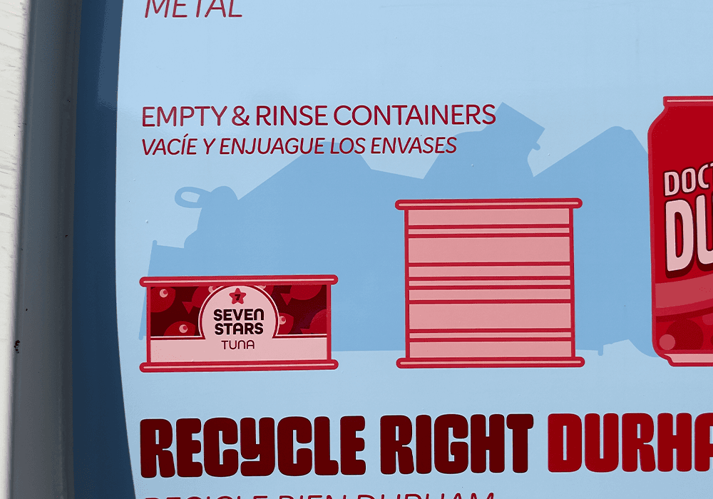
Replace photorealistic item grids with oversized faux-product illustrations, and set the oversized category word in distinctive typography— both inspired by 1970s visual styles.
Civic Signal - Make The Source Feel Trustworthy Instantly
Move: Use the official City palette and its tints and shades so “this is from the City of Durham” lands before anyone reads a word.
Glanceability - Deliver the message in motion
Move: Show only the six or seven most common items in each recycling category instead of attempting to depict every possible item. Pair that restraint with minimal copy, disciplined hierarchy, and generous negative space for a moving-truck, drive-by view. Apply the 10-to-1 Legibility Rule so all text and recyclable silhouettes read cleanly from 30–65 feet.
The Bull as Anchor - Durham’s shared mascot
Move: Feature the Bull across the faux products as a recurring local cue because all Durham residents love the Bull. This makes the signs feel like Durham in a single glance.
Joyful Reward - Close-up payoff that earns repeat looks
Move: Build faux-product labels as playful micro-stories — bull puns, Durham locations, and community “insider” knowledge — so the compliance messaging rewards closer looks with a quick laugh.
Examples:
1869 Ketchup - city founding date as a brand gag
Doctor Durm Cola - Dr. B.S. Durham reference + “Durm” local pronunciation of Durham
Eno River Bottling Co. - local popular location name credibility
Raging Bull Baked Beans / Hoofenstein Crunch - bull-as-pop-culture label jokes
Major’s Fresh Stomped OJ - hoofprint orange + iconic Major the Bull sculpture
Equity-Efficient Bilingual - Serve two audiences without two SKUs
Move: Place Spanish-lite “captions” directly beneath the primary English instructions in smaller, lighter type on the same layout. Illustration labels remain English-only.
Language-Agnostic Comprehension - Understanding shouldn’t depend on reading
Move: Choose items with distinct silhouettes — bottle, can, carton, and jug — and simple pictorial label art so the items remain identifiable through visuals alone. The labels are decorative; meaning is conveyed by shape and picture.
Contrast-First Accessibility - Remain Legible In Sun, Shade, And Motion
Move: Apply WCAG 2.1 AA contrast minimums, at least 4.5:1 for small text and 3:1 for large text, as an ADA-aligned best practice for physical signs.
Multi-Scale Ready - Street to kitchen without redesign
Move: Use vector artwork, high-contrast forms, and disciplined hierarchy so the truck-side panels downscale cleanly into larger-than-average refrigerator magnets.
Why This Works
Tell people what’s accepted = less contamination. (EPA REO)
U.S. EPA Recycling Education and Outreach research supports clear guidance about accepted materials.
Clear “decision labels” cut confusion.
Bin-label research demonstrates the mechanism; the vehicle signs use the same behavioral lever. (The Recycling Partnership)
Simple, targeted guidance improves capture and reduces contamination. (WRAP)
Targeted reminders reduce recycling contamination.
Communities that used cart tags and mailings reduced recycling contamination by approximately 19–62%. In Atlanta, routes that received cart tagging and education showed a 19% decrease in contamination compared with routes that had not yet received the campaign. Vehicle signs are a different channel, but both approaches repeatedly reinforce what belongs—and does not belong—in the recycling bin. (Oregon DEQ study; The Recycling Partnership’s Atlanta results)
(Sources: U.S. EPA Recycling Education and Outreach; The Recycling Partnership bin-label research and Atlanta Feet on the Street results; WRAP recycling-communications guidance; and Oregon DEQ’s 2024 Cost-Effective Contamination Reduction Methods.)
Build & Rollout
Scale
32 recycling trucks with two signs per truck—one per side—for 64 total signs.
4 Designs
Metal, Paper, Plastic, Glass
Pairings
Glass and Plastic appeared on the same trucks. Metal and Paper appeared on the same trucks.
Material
Waterproof, highly UV-resistant vinyl with a designed lifespan of three to five years, including exposure to truck washing.
Bilingual Proofing
I collaborated with the City Communications team on Spanish-language proofing.
At-home Extension
Refrigerator magnets were designed but not produced.
My Role
Strategy
Strategy + Creative Direction + Hand-Drawn Illustration + Design + Production (Print-Ready Files + Vendor Coordination) + Client Leadership (Pitch + Reviews)
TL;DR
Client
City of Durham | Solid Waste Management Department
(now part of the Environmental & Street Services Dept.)
Client Ask
Create large-format truck signage in the typical recycling style (green palette, triangle logo, photorealistic item grids) to shift resident recycling behavior and cut blue bin contamination especially hazardous mis-loads.
What I Did
I identified a hidden challenge behind the client ask— residents had learned to ignore the visual conventions of recycling communication.
I reframed the ask into a City of Durham-branded, joy-filled, bilingual system that breaks through the “I’ve seen this before” response, delivers its message in 3–5 seconds, and gives residents memorable visual cues they can recall later when deciding whether to recycle.
My Role
Strategy + Creative Direction + Hand-Drawn Illustration + Design + Production (Print-Ready Files + Vendor Coordination) + Client Leadership (Pitch + Reviews)
Put It In The Blue Bin
Vehicle Recycling Signs
Case Study
Project Context
Client
City of Durham | Solid Waste Management Department
(now part of the Environmental & Street Services Dept.)
Client Ask
The client asked for its version of the typical large-format recycling sign: a green-dominant color palette, rows of photorealistic item illustrations, and the three-arrow recycling triangle logo.
Client Objective
Create effective, large-format, vehicle-based recycling signage that helps residents put more accepted materials and fewer hazardous or non-recyclable items in the blue bin.
(Priority hazards included TVs, computers, monitors, and car batteries. When compacted, these items could damage trucks, injure drivers, and slow pickups by requiring drivers to stop for on-the-spot sorting. Other non-hazardous but non-recyclable items required additional sorting at recycling facilities, increasing costs and pulling staff away from higher-value services for residents.)
Additional Problem I Identified
Beyond contamination and sorting costs, I identified a communication problem the original brief did not address: residents had learned to ignore the familiar visual conventions of recycling messaging before absorbing what the signs said.
Read More